Logo, colour on dark
SVG file of Logo, colour on darkPNG file of Logo, colour on dark

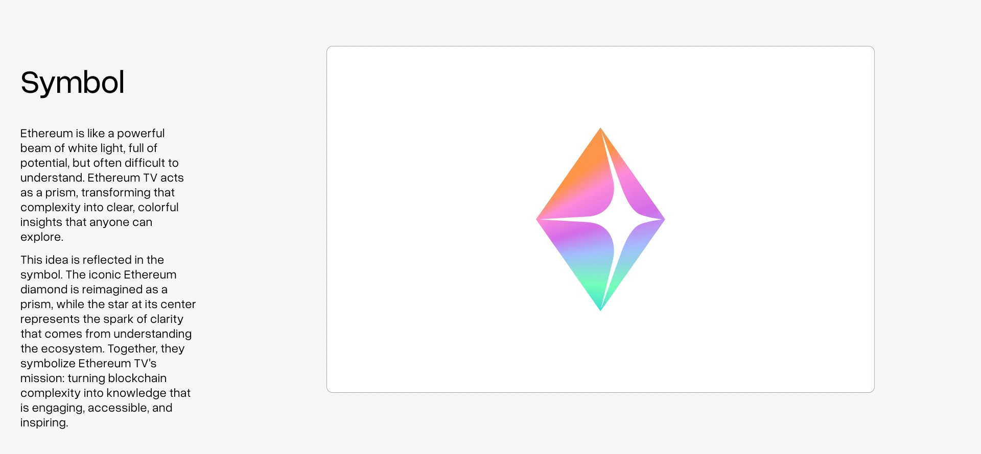
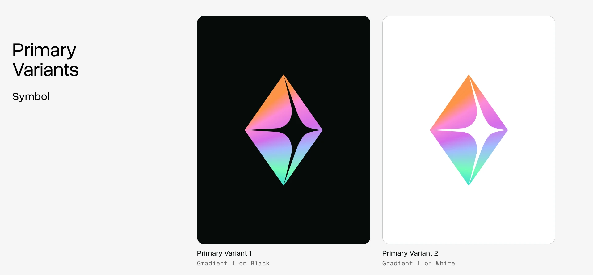
Ethereum TV is the prism. These are the guidelines the identity was built on: the mark, the palette, the gradients, the type. The files are yours to use. Take them, use them well, and leave the mark as it was drawn.
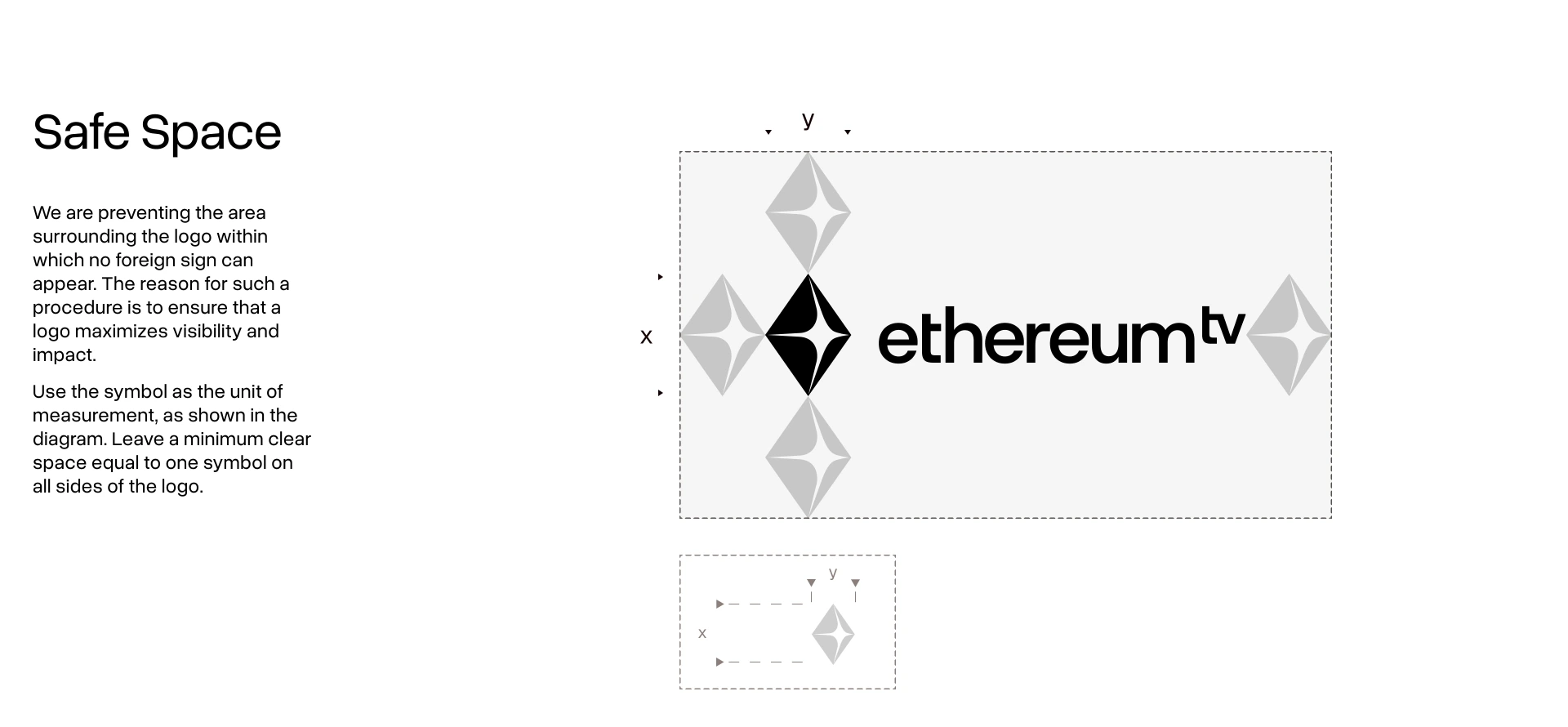
The lockup is the symbol and the wordmark drawn as one piece. Use the files below. Never rebuild it by setting the name in another typeface.
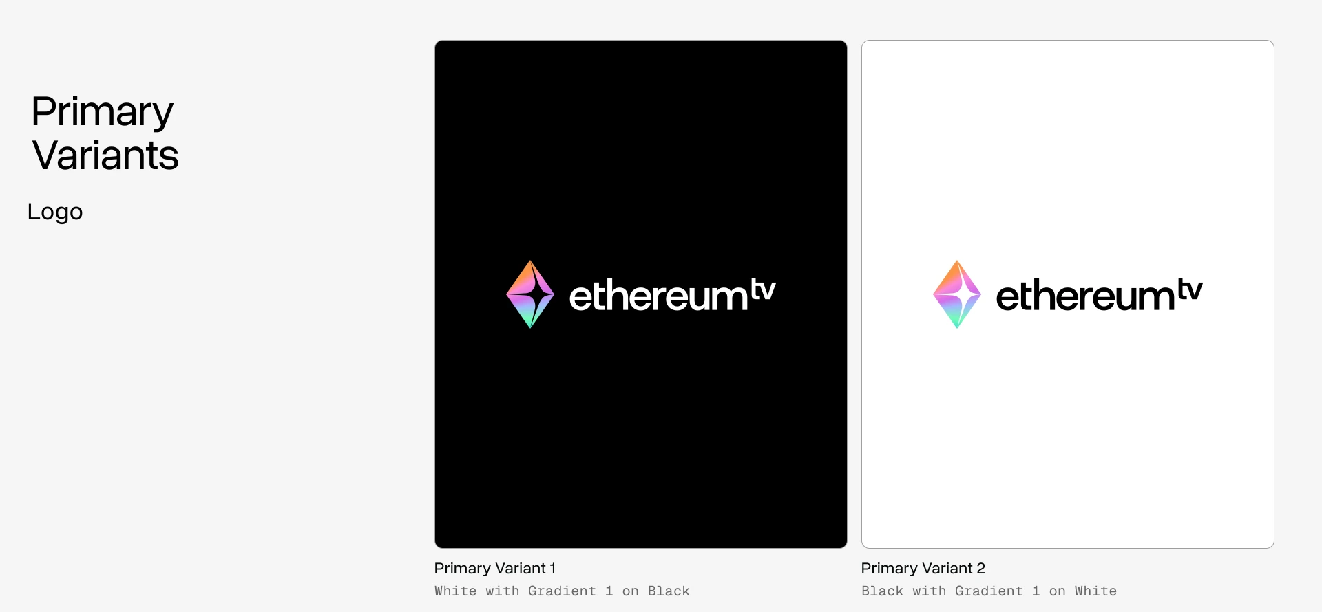
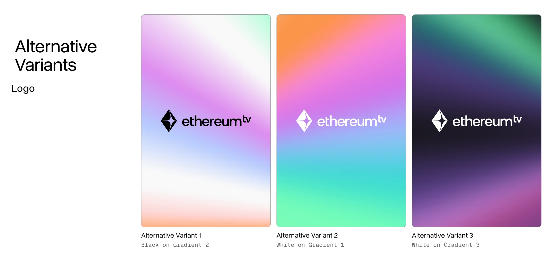
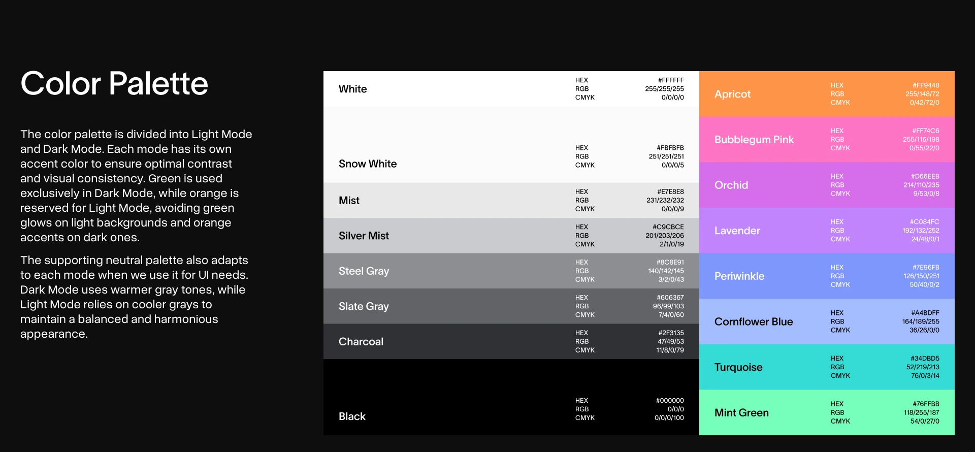
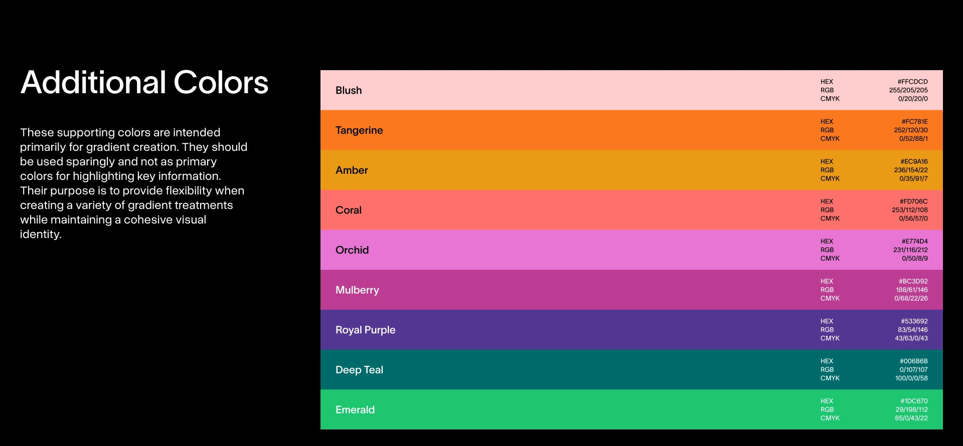
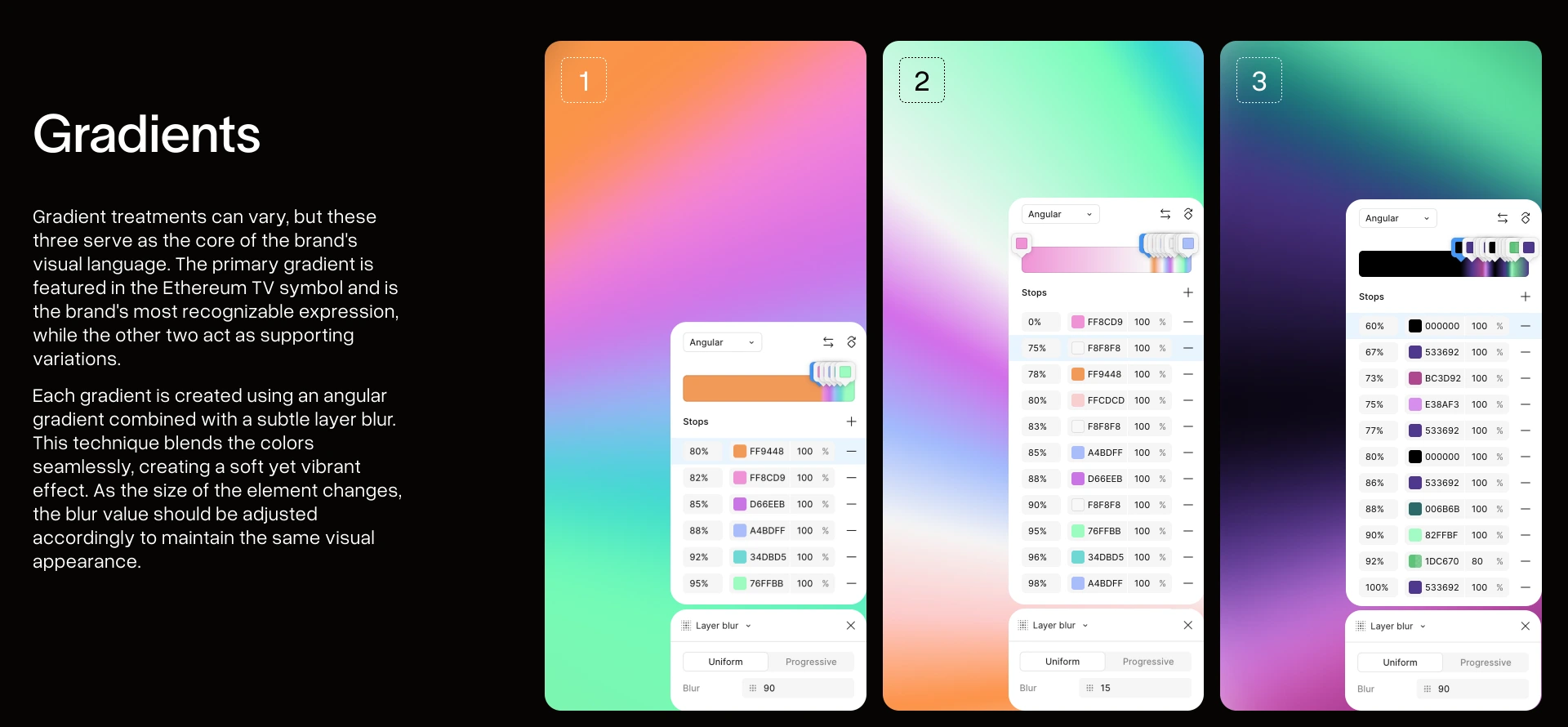
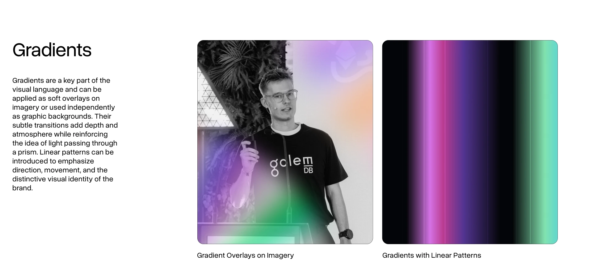
Light and dark each get their own accent so contrast holds either way. The three gradients are the brand at its loudest: angular sweeps with a soft blur, scaled to whatever they sit on.
Copy a value
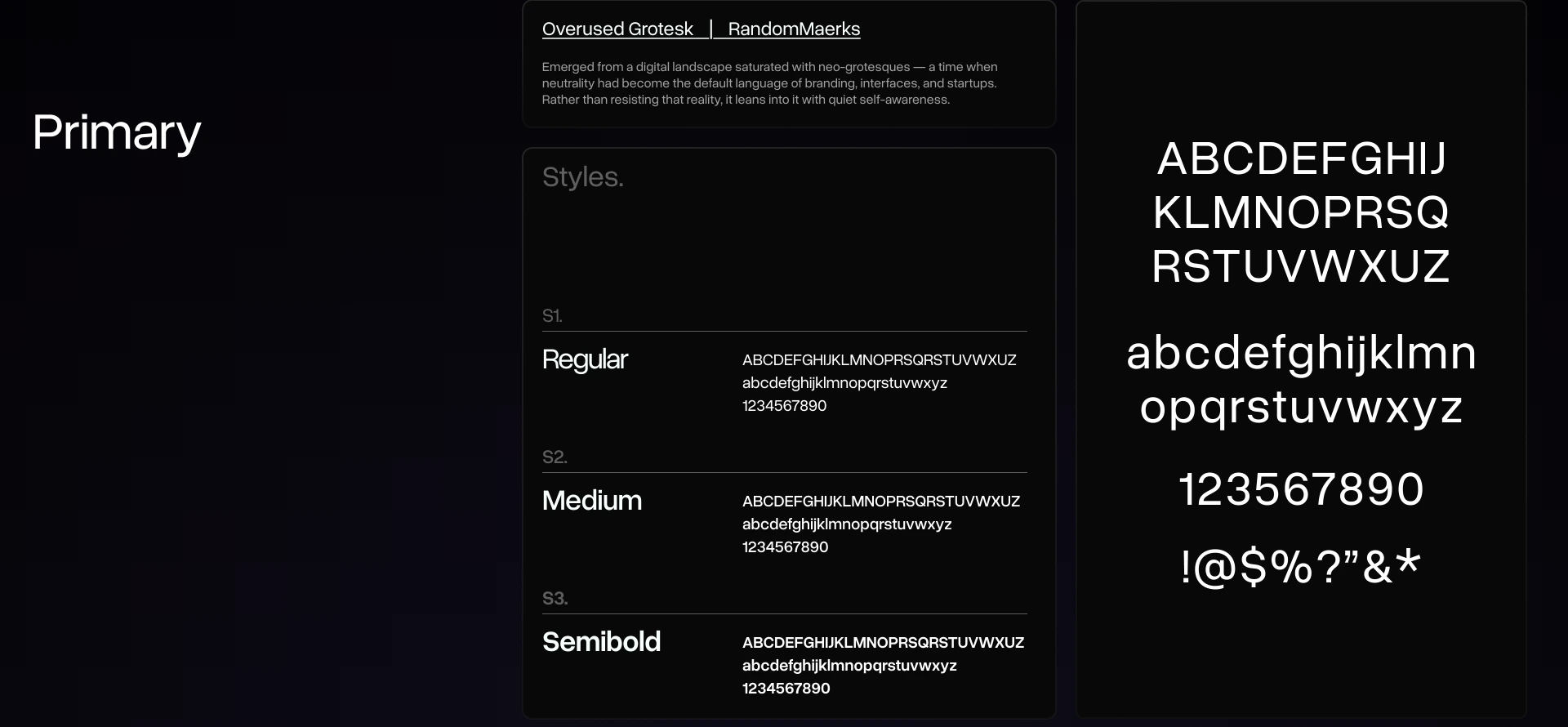
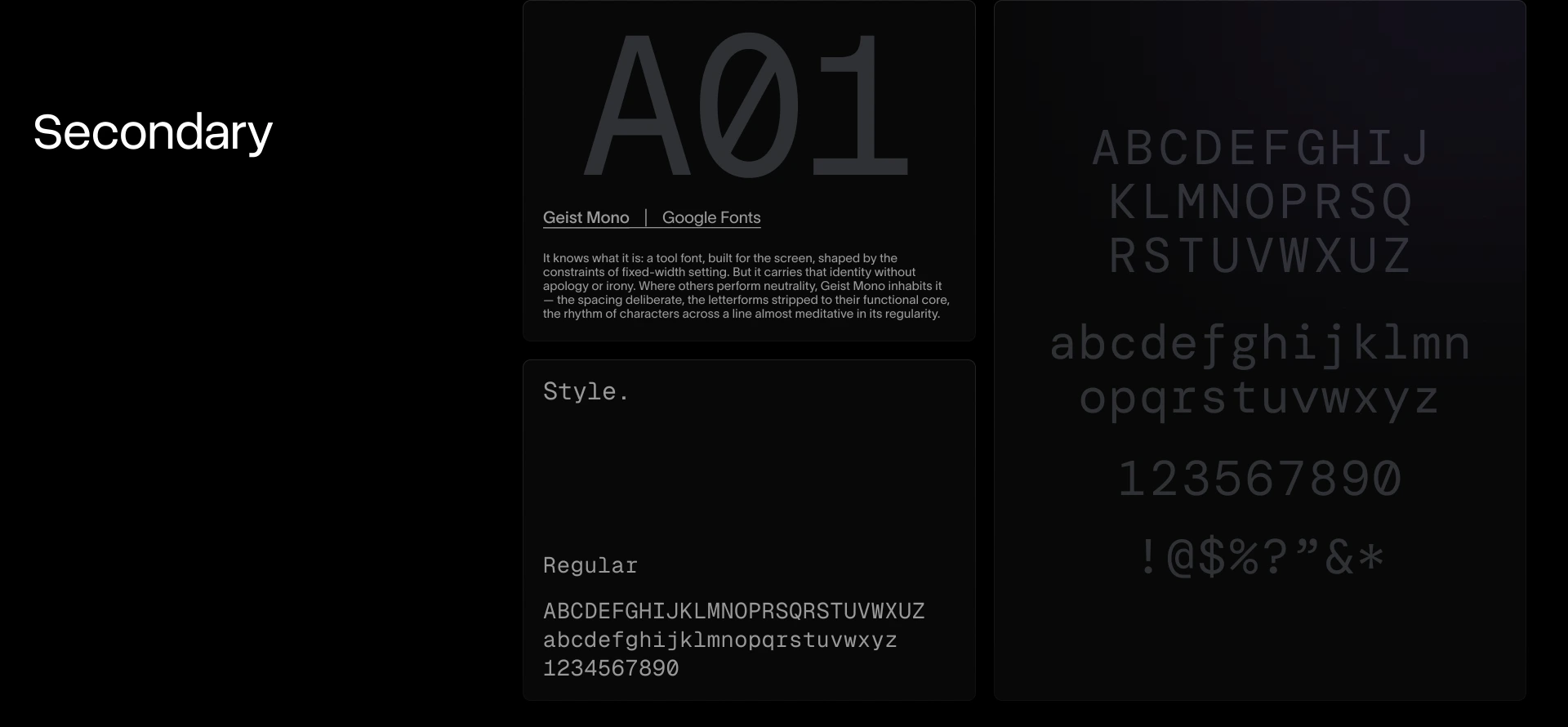
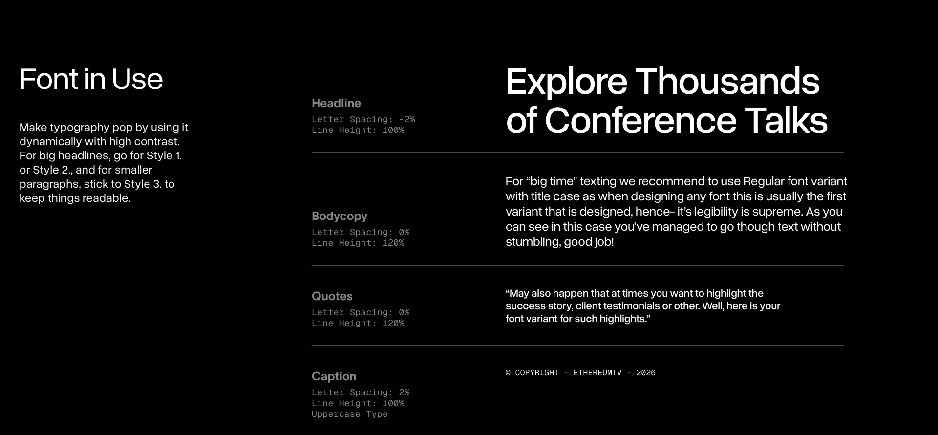
Two typefaces, both open source. Overused Grotesk carries everything you read. Geist Mono carries everything you scan.
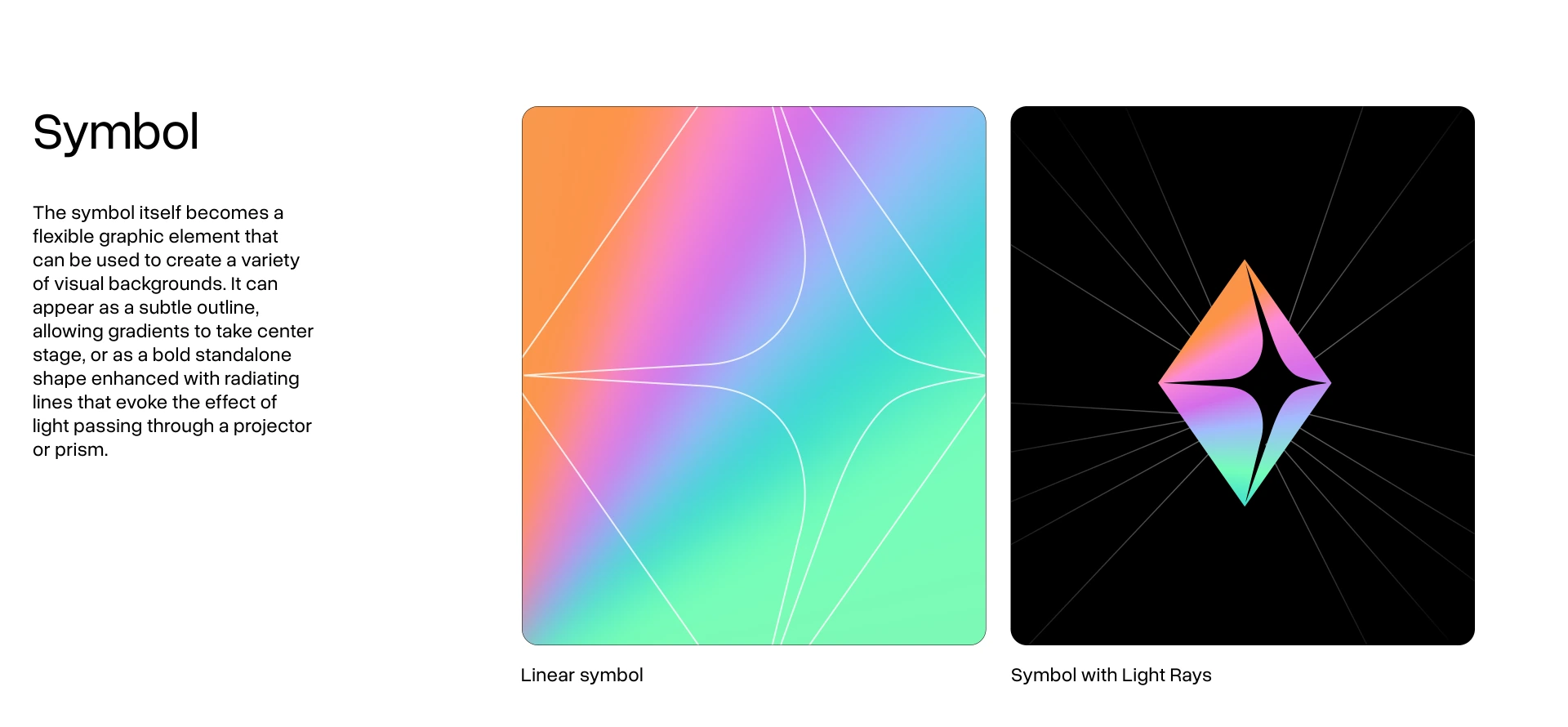
The symbol doubles as a graphic field: a soft outline that lets a gradient take the stage, or a bold shape with light rays breaking out of it. Under all of it sits the layout grid.
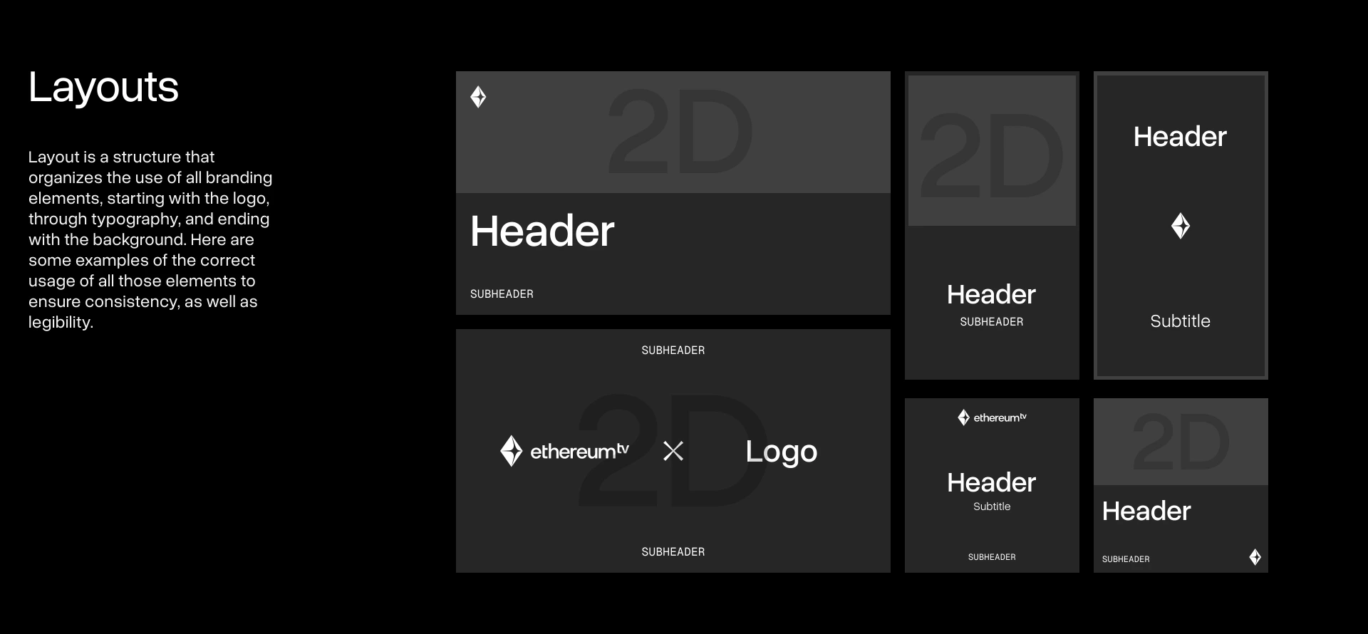
The shapes the brand takes once it leaves the guidelines.
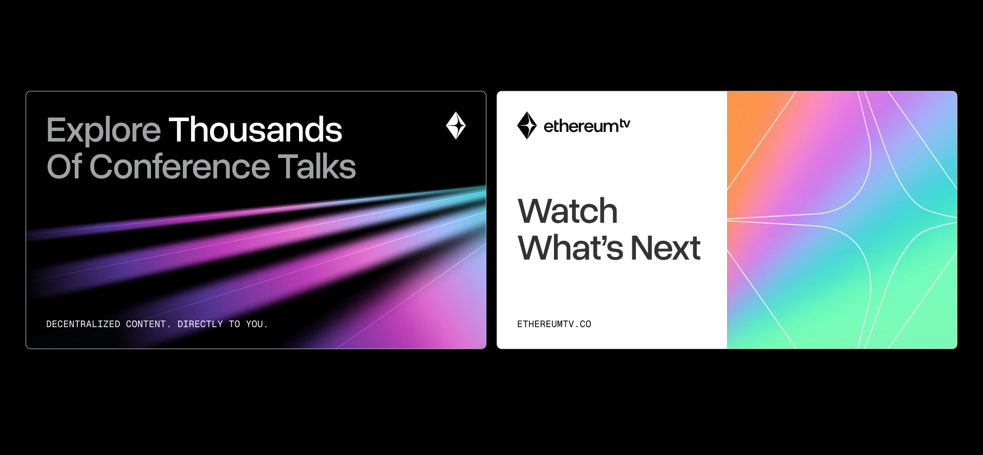
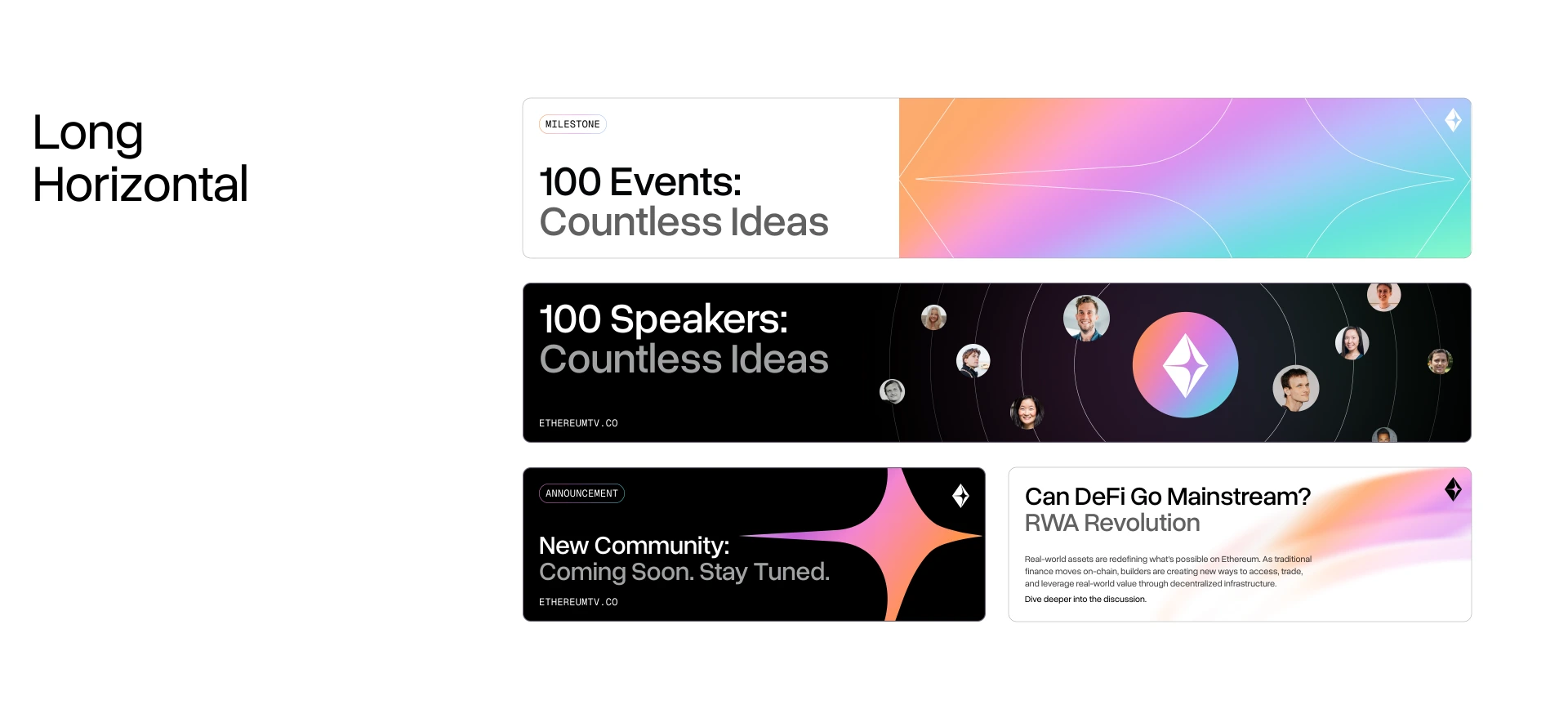
Every mark as SVG and as a transparent PNG. Reach for the SVG whenever you can, since it scales without losing an edge.
SVG file of Logo, colour on darkPNG file of Logo, colour on dark

SVG file of Logo, colour on lightPNG file of Logo, colour on light



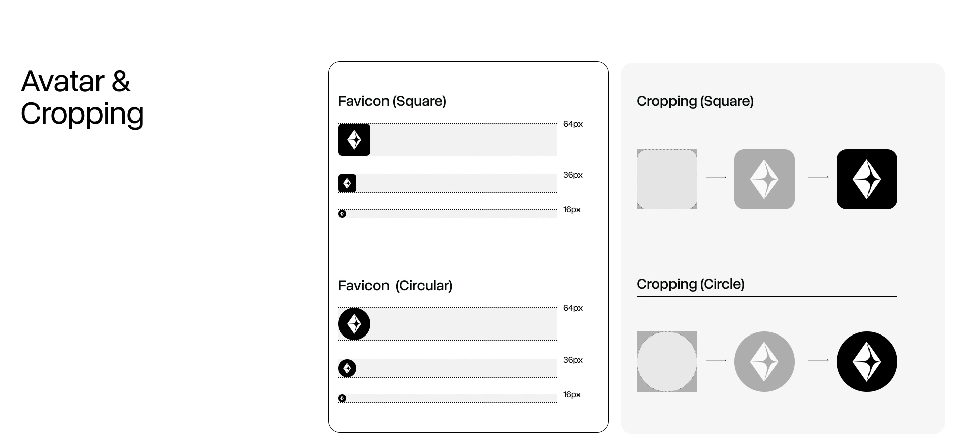
Logo, symbol and favicon in both formats, with a one-page read-me of the rules. About 500 KB.